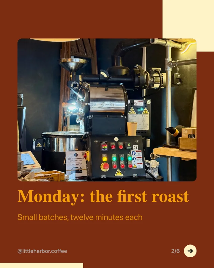
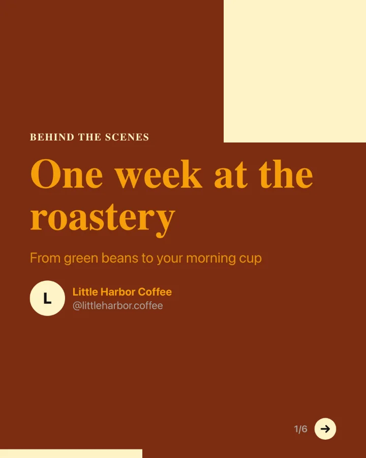
A LinkedIn carousel is a PDF uploaded as a document post. People swipe through it like slides, and they save and share good ones. Here is what matters.
Size
- Portrait, 1080 by 1350 pixels (4:5) takes the most space on a phone screen, where most people read LinkedIn.
- Square, 1080 by 1080 also works and is easy to reuse on Instagram.
- Keep every page the same size, and keep text away from the edges.
How many slides
Six to twelve slides is a good range. Fewer feels thin; many more and people stop before the end. One idea per slide, in large type that reads on a small screen.
A structure that works
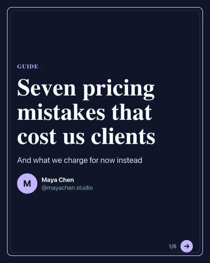
- Cover: the promise in a few words, like "7 pricing mistakes that cost us clients". Add your name and photo so people know who it is from.
- Context: one slide on why this matters or what went wrong.
- Points: one slide for each point, each with a short title and one or two sentences.
- Summary: the points on one slide, for people who want to save it.
- Call to action: follow, comment, or visit a link. Ask for one thing only.
Design tips
- Use two or three colours from your brand and one font family.
- Number the slides so people know how far they are.
- Give the caption its own hook. The carousel does not replace the post text.
SocialBat's carousel maker writes the slides from a topic, a link or your notes, applies your brand kit, and exports the PDF to schedule as a LinkedIn document post.